Creating Effective Business Signage: Design Tips and Best Practices
Effective business signage is more than just a marker for your location, it's a crucial marketing tool that communicates your brand identity and attracts potential customers. Whether you're designing outdoor signs, window displays, or interior signage, following these design principles will help ensure your signage delivers maximum impact.
Visibility Is Everything
The primary purpose of any sign is to be seen. Even the most creative design fails if people can't easily spot and read it:
- Size matters: Make your sign large enough to be visible from your intended viewing distance. For roadside signs, remember that motorists may have only seconds to notice and process your message.
- Consider viewing angles: Account for how and where potential customers will see your sign, including from vehicles or across the street.
- Contrast is critical: Ensure strong contrast between text and background colors for maximum readability.
- Account for lighting conditions: Test how your sign appears in different lighting and weather situations, particularly if it will be viewed primarily during specific times of day.
Clarity and Simplicity
In signage design, less is often more:
- Limit text: Keep wording brief and focused on essential information. The average person should be able to read and understand your sign within 3-5 seconds.
- Use simple language: Avoid industry jargon or complicated terminology.
- Prioritize information: Display your business name prominently, followed by your primary service or unique selling proposition.
- Avoid clutter: Empty space around text and graphics (known as white space) actually improves readability and impact.
Typography Matters
Font choices significantly impact both readability and brand perception:
- Choose readable fonts: Sans-serif fonts like Arial, Helvetica, or Calibri generally offer better readability from a distance than decorative or script fonts.
- Size appropriately: As a rule of thumb, letters should be at least 2.5 cm tall for every 10 meters of viewing distance.
- Avoid using too many fonts: Limit your sign to 1-2 complementary font families to maintain a cohesive appearance.
- Consider spacing: Proper letter spacing (kerning) and line spacing (leading) dramatically impact readability.
Color Psychology
Colors evoke specific emotions and associations that can work for or against your brand message:
- Red: Creates urgency, excitement, and passion. Good for clearance sales or restaurants.
- Blue: Conveys trust, security, and professionalism. Excellent for banks, healthcare, and technology.
- Green: Suggests growth, health, and environmental consciousness. Ideal for organic products, financial services, or wellness businesses.
- Yellow: Communicates optimism, clarity, and warmth. Catches attention but can strain eyes if overused.
- Black: Projects sophistication, luxury, and authority. Effective for premium brands or formal businesses.
Always ensure your sign colors align with your overall brand palette for consistency across all marketing materials.
Materials and Durability
The physical construction of your sign affects both its appearance and longevity:
- Match materials to placement: Outdoor signs require weatherproof materials like aluminum, acrylic, or treated wood. Browse our signage and branding products for available material options.
- Consider lifespan requirements: Temporary event signage needs different materials than permanent storefront signs.
- Account for maintenance: Some materials require regular cleaning or maintenance to maintain appearance.
- Lighting options: Consider whether your sign needs illumination for nighttime visibility, and choose appropriate materials for your lighting method.
Compliance Considerations
Before finalizing any signage design, research relevant regulations:
- Local municipal bylaws often restrict sign size, placement, and lighting
- Shopping centres and office parks typically have their own signage guidelines
- Certain industries have specific signage requirements
Testing and Feedback
Before investing in permanent signage:
- Create scale mockups or digital renderings to evaluate design
- Test readability from intended viewing distances
- Gather feedback from people unfamiliar with your business
- View mockups under different lighting conditions
Signage Materials for South African Conditions
South Africa's diverse climate presents specific challenges for outdoor signage. From the salt-laden coastal air of the Western Cape to the intense UV exposure of the inland highveld, choosing the right substrate is essential to getting lasting value from your signage investment.
Aluminium Composite Panel (ACP/Alubond)
The most popular substrate for fascia and flat panel signage. ACP consists of two thin aluminium sheets bonded to a polyethylene core, making it lightweight yet rigid. It is weather-resistant and accepts vinyl graphics or direct UV printing with excellent results. ACP performs well in both coastal and inland areas and resists warping even under the high temperatures common during South African summers. Standard panel thicknesses range from 3mm to 6mm, with 3mm being the most common for signage applications.
Correx (Corrugated Polypropylene)
Lightweight, affordable, and ideal for temporary or short-term signage, estate agent boards, event signs, and construction site hoardings are all common applications. Correx is water-resistant and easy to cut, making it a practical choice for signage that needs to be produced quickly and in volume. However, it is not UV-stable for extended outdoor use without UV-resistant printing or lamination, so it is best suited to applications with a lifespan of a few weeks to a few months.
Chromadek (Pre-painted Steel)
Durable, rust-resistant steel commonly used for larger signs and billboards across South Africa. Chromadek handles the South African sun well, maintaining its structural integrity and providing a smooth surface for high-quality screen-printed or vinyl graphics. It is heavier than ACP, which means sturdier mounting brackets and frames are required, but its rigidity makes it an excellent choice for large-format installations where wind loading is a consideration.
Acrylic and Perspex
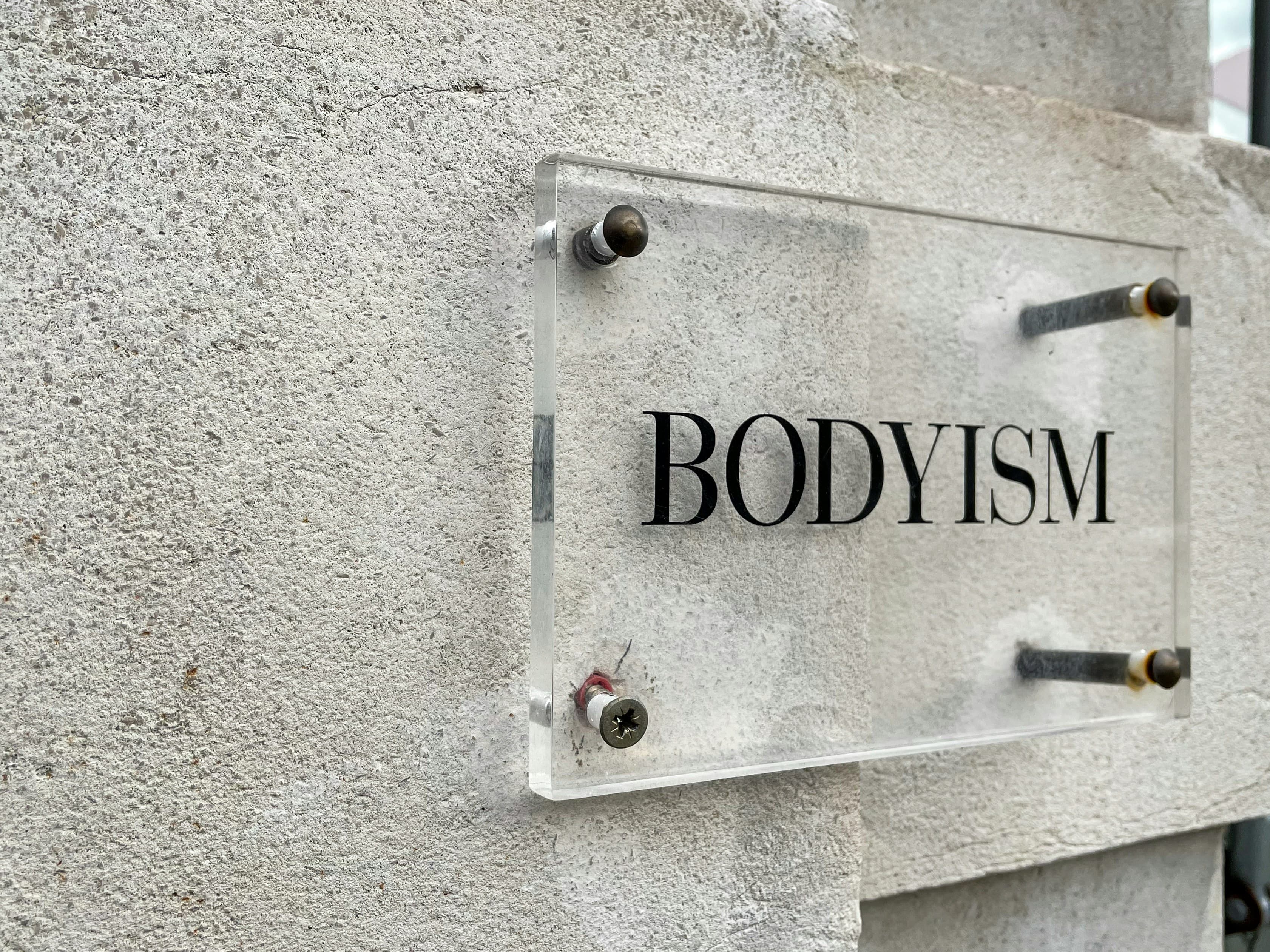
Acrylic creates a sleek, modern look for indoor and sheltered outdoor applications. Available in clear, frosted, or coloured options, it can be laser-cut into intricate shapes and is frequently used for reception signs, directional signage, and professional plaques. Acrylic can also be backlit for illuminated signage, producing an even, attractive glow. It is susceptible to scratching, so it is best used in locations where it will not be subject to regular physical contact or abrasion.
PVC Foam Board (Forex)
Lightweight, smooth-surfaced, and easy to cut into custom shapes, PVC foam board is excellent for indoor signage, point-of-sale displays, and exhibition graphics. Its closed-cell structure means it will not absorb moisture, making it dimensionally stable in air-conditioned environments. Standard thicknesses range from 3mm to 10mm. It is not recommended for long-term outdoor use in direct sunlight, as prolonged UV exposure can cause yellowing and brittleness over time.
Types of Business Signage and When to Use Each
Understanding which signage format suits your specific business situation helps you invest wisely and achieve the best return on your signage spend. Many businesses benefit from a combination of signage types working together, a fascia sign for permanent identification, window graphics for seasonal promotions, and an A-frame for daily foot traffic. Your signage provider can advise on the most effective combination for your location and budget.
Fascia Signs
Mounted directly to the building facade above the entrance, fascia signs are the most common type of business signage. They are available as flat panels with applied vinyl graphics, built-up (three-dimensional) individual letters, or internally illuminated lightbox formats. A well-designed fascia sign is your primary identifier to passing foot and vehicle traffic and often forms the first impression a potential customer has of your business. Built-up lettering, where individual letters are fabricated from aluminium or acrylic and mounted with spacers, creates a three-dimensional effect with natural shadow lines that adds a premium feel to any shopfront.
A-Frame / Pavement Signs
Freestanding, double-sided signs placed on the pavement outside a business. A-frames are ideal for foot-traffic areas, where they can promote daily specials, highlight seasonal offerings, or direct customers to your entrance from around a corner. They are portable and easy to update, many use interchangeable printed inserts or chalkboard panels that staff can refresh throughout the day.
Pylon and Freestanding Signs
Tall, standalone structures typically found at shopping centres, fuel stations, and businesses set back from the road. Pylon signs maximise visibility from a distance, rising above walls, fences, and other obstructions that might hide a building-mounted sign. They can include illumination for round-the-clock branding and usually require municipal approval and a structural engineering sign-off before installation. Multi-tenant pylon signs at shopping centres allow several businesses to share a single high-visibility structure, with each tenant occupying a panel within the overall sign frame.
Window Graphics
Applied directly to glass surfaces, window graphics range from subtle frosted vinyl for privacy and branding to full-colour printed contravision (one-way vision) film that displays vibrant graphics on the outside while allowing people inside to see out. Window graphics are excellent for retail displays and can be updated seasonally without affecting the building structure. See our guide on shopfront signage and window graphics for more detail.
Pull-up Banners and Portable Displays
Retractable banners that travel easily to events, exhibitions, and pop-up locations. They are lightweight, quick to set up without any tools, and relatively affordable. Standard sizes are 850mm x 2000mm and 1000mm x 2000mm, printed on durable PVC or polyester media housed in an aluminium cassette base. Pull-up banners are a staple for trade shows, conferences, and in-store promotions where professional presentation matters but permanent installation is not practical.
Lightbox Signs
Internally illuminated signs using energy-efficient LED strip modules behind a translucent acrylic or polycarbonate face panel. Lightboxes provide round-the-clock brand visibility and project a professional, polished appearance that stands out particularly well after dark. Modern LED technology keeps running costs low, typically consuming a fraction of the electricity that older fluorescent lightboxes required, and offers a long operational lifespan before modules need replacement.
Placement and Visibility Considerations
Even the best-designed sign will underperform if it is poorly positioned. Understanding the science of effective sign placement helps you get the most from your investment.
- Viewing distance: the further away viewers are, the larger text and graphics need to be. A general guideline is 25mm of letter height for every metre of intended reading distance. A sign meant to be read from 20 metres away, for example, needs lettering at least 500mm tall.
- Viewing angle: signs perpendicular to the direction of traffic are visible for a longer duration than those mounted parallel to it. For narrow streets where a flat fascia sign may only be visible for a brief moment, consider blade signs (projecting outward from the building) to catch the eye of passing pedestrians and motorists earlier.
- Height: signs mounted above eye level need larger text to compensate for the upward viewing angle and increased distance. Signs at or below eye level, such as pavement signs and window graphics, work particularly well for pedestrian traffic where people naturally look straight ahead or slightly downward.
- Obstructions: check for trees, poles, other signage, or parked vehicles that may block sightlines at certain times of day or year. Deciduous trees that are bare in winter may completely obscure a sign once they are in full leaf during summer.
- Speed of traffic: fast-moving vehicle traffic requires larger, simpler signage with bold colours and minimal text. Drivers at highway speeds may have fewer than three seconds to notice, read, and process a sign. Pedestrian areas allow more detailed messaging, secondary information, and smaller supporting text.
Signage Maintenance and Longevity
Your signage is a long-term investment, and proper maintenance ensures it continues to represent your business well for years to come. A well-maintained sign reinforces the message that your business is active, professional, and attentive to detail, qualities that customers naturally associate with the products or services you provide.
- Regular cleaning with mild soapy water and a soft cloth removes the dirt, pollen, and pollution build-up that gradually dulls vinyl colours and obscures graphics. Avoid abrasive cleaners or high-pressure washers, which can damage printed surfaces and vinyl edges.
- Inspect fixings and mounting hardware periodically, especially after storms or periods of high wind. Loose brackets can cause signs to vibrate, leading to cracked panels or detached lettering over time.
- Vinyl graphics typically last five to seven years outdoors before noticeable fading or edge lifting occurs, depending on UV exposure and orientation. Plan for periodic refreshes to keep your branding looking crisp and current.
- Illuminated signs should have their LED modules checked annually. Replace individual sections promptly if they fail, as partially lit signs can look neglected and undermine customer confidence.
- Damaged or faded signage reflects poorly on the business it represents. Replace or repair deteriorated signs promptly rather than leaving them in place, a worn sign can suggest a business that does not pay attention to detail, which is not the impression you want to create.
- Seasonal considerations: in the Western Cape, winter storms with strong north-westerly winds can stress mounting hardware, while the dry summer months bring dust build-up. Inland areas face intense summer thunderstorms and hail. Schedule your maintenance inspections around these seasonal patterns for the best results.
Effective signage represents a significant but worthwhile investment for your business. At Winelands Printing & Signage, our design team can help you create custom signage that aligns with your brand while maximising visibility and impact. Contact us today to discuss your business signage needs.