
Why AI Artwork Isn't Print-Ready
AI image generators create stunning visuals, but those JPEG files aren't ready for print. Learn the difference between screen art and press-ready artwork.
Read More
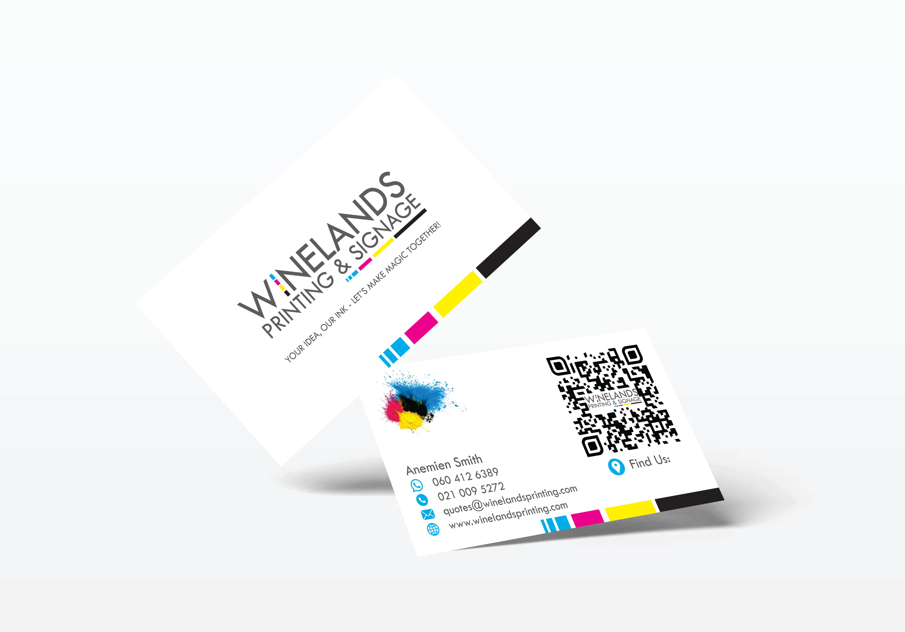
In today's increasingly digital world, the physical business card remains a surprisingly powerful networking and marketing tool. A well-designed business card does more than just share your contact information, it creates a tangible reminder of your brand and makes a lasting impression. Here's how to design business cards that recipients will keep, remember, and actually use.
Begin by ensuring your card includes all necessary information without overcrowding:
For international business, consider adding a country code to your phone number and potentially including information in multiple languages on opposite sides of the card.
Resist the temptation to fill every millimeter of your business card. White space (empty areas) helps direct attention to the most important elements and creates a cleaner, more professional appearance. A cluttered card often ends up in the bin, while a clean design is more likely to be kept.
Not all information on your card deserves equal prominence. Use size, weight, and positioning to guide the viewer's eye:
Your business card should be instantly recognisable as part of your brand family:
The goal is for someone to make an immediate connection between your card and other branded materials they've seen. For more on this topic, read our guide on the importance of brand consistency across all marketing materials.
Font selection impacts both readability and perception of your brand:
The quality and type of card stock significantly impacts perception. Our guide to choosing the right paper covers this topic in depth, but here's a quick overview:
Consider these techniques to make your card stand out:
Special finishes typically increase cost but can dramatically enhance memorability and perceived value.
Cards that serve an additional purpose are more likely to be kept:
A well-implemented QR code can bridge the physical-digital divide:
If using a QR code, always test it thoroughly and include a brief description of where it leads.
The finishes mentioned above deserve a closer look. Each technique creates a distinct impression and can elevate a standard card into something recipients genuinely want to keep. Understanding how these finishes work helps you make informed decisions when briefing your printer.
Spot UV is a clear, glossy varnish applied to specific areas of the card rather than the entire surface. It is typically laid over a matte or silk laminated base, creating a striking contrast between the soft, muted background and the high-gloss highlighted zones. Designers commonly use spot UV to draw attention to logos, key text, or graphic elements. Beyond the visual contrast, spot UV adds a raised, tactile dimension, recipients can feel the glossy areas when they run a finger across the card, which invites touch and makes the card more memorable. For maximum effect, keep the spot UV areas selective; highlighting everything defeats the purpose.
Foil stamping involves pressing a thin layer of metallic foil onto the card stock using a heated die. The result is a luxurious, eye-catching metallic effect that catches and reflects light. Foil is available in a range of finishes including gold, silver, rose gold, copper, and holographic options. It works best when applied to specific elements, logos, borders, names, or key text, rather than large filled areas, where coverage can become uneven. Foil stamping can also be combined with embossing to create a raised metallic effect that is both visually and tactilely impressive. This combination is particularly popular for high-end professional cards where the goal is to convey prestige and attention to detail.
Embossing raises selected elements above the surface of the card, while debossing presses them into it. Both techniques create a three-dimensional, tactile effect that adds depth and sophistication. Blind embossing, where the raised or recessed area is left without ink or foil, produces a subtle, understated look that rewards closer inspection. This technique works particularly well on heavier card stocks (400gsm and above), where the paper has enough body to hold the dimensional effect without warping or weakening. Embossing and debossing are often used for logos, monograms, or decorative borders, and they pair well with other finishes like foil stamping for a layered, premium result.
Beyond the standard 90mm x 55mm rectangle, business cards can be cut into custom shapes that reflect your brand personality. Rounded corners are the most common variation and give cards a softer, more modern feel. More adventurous options include circular cards, folded cards that open like a mini-brochure, or shapes that directly reference the business, such as a house silhouette for an estate agent or a camera shape for a photographer. Mini cards (approximately 85mm x 25mm) offer a sleek, minimalist alternative, while square cards (55mm x 55mm) stand out immediately in a stack of standard rectangles. Keep in mind that non-standard shapes may not fit conventional card holders or wallets, so weigh the novelty factor against everyday practicality.
Edge painting involves applying a bold colour to the exposed edges of thick card stock, typically 600gsm or heavier, or duplexed (two sheets bonded together) stock. The colour creates a subtle but striking pop that is visible when the card is viewed from the side or held in a stack. Edge painting works best when the chosen colour complements or contrasts with the card's face design, for example, a clean white card with a vivid orange or deep navy edge. Because the technique requires a substantial card thickness to be visible, it naturally pairs with premium, heavier stocks that already convey quality through weight and rigidity.
Different professions benefit from different design approaches. Tailoring your card to your industry helps reinforce the right message from the moment it is handed over.
Regardless of your industry, the most effective business cards align the design language with the expectations of the people receiving them. When someone glances at your card, the design should immediately reinforce what your business is about, before they even read the text.
QR codes are just one way to bridge the gap between a physical card and your digital presence. Several other approaches can enhance the connection.
NFC-enabled business cards contain a small Near Field Communication chip embedded in the card stock. When a recipient taps the card against their smartphone, it can automatically open a webpage, prompt a contact save, or launch a specific app, no scanning required. NFC cards feel seamless and modern, though they do carry a higher per-unit cost than standard printed cards.
Digital vCards and contact pages allow recipients to save your details to their phone contacts with a single tap. Linking to a dedicated contact page or downloadable vCard file removes the friction of manual data entry and reduces the chance of typos in your phone number or email.
Social media handles are more useful than full URLs on a printed card. Include recognisable platform icons alongside your handle (e.g., the LinkedIn logo followed by your profile name) so recipients can find you quickly without typing a lengthy web address.
Short, memorable URLs are preferable to long, complex ones that are difficult to type. A dedicated landing page such as yourname.com/card can house your full contact details, links to social profiles, portfolio samples, and a direct enquiry form, all in one tidy location that is easy to remember and share.
Whichever digital integration method you choose, the key principle is the same: reduce friction. The fewer steps a recipient needs to take to save your details or connect with you online, the more likely they are to do so. A card that bridges the physical and digital worlds seamlessly is far more valuable than one that simply lists information.
Remember, your business card is often the first physical representation of your brand that potential clients encounter. At Winelands Printing & Signage, we offer a range of premium business card printing options, from standard designs to luxury finishes. Contact our team to discuss how we can help you create business cards that truly represent your brand and leave a lasting impression.
AI image generators create stunning visuals, but those JPEG files aren't ready for print. Learn the difference between screen art and press-ready artwork.
Read More
Explore the world of large format printing, from canvas art and custom wallpaper to event banners and foam board displays. A complete guide to substrates, costs, and applications.
Read More
Understanding different paper types, weights, and finishes is crucial for achieving the best results in your print projects.
Read More