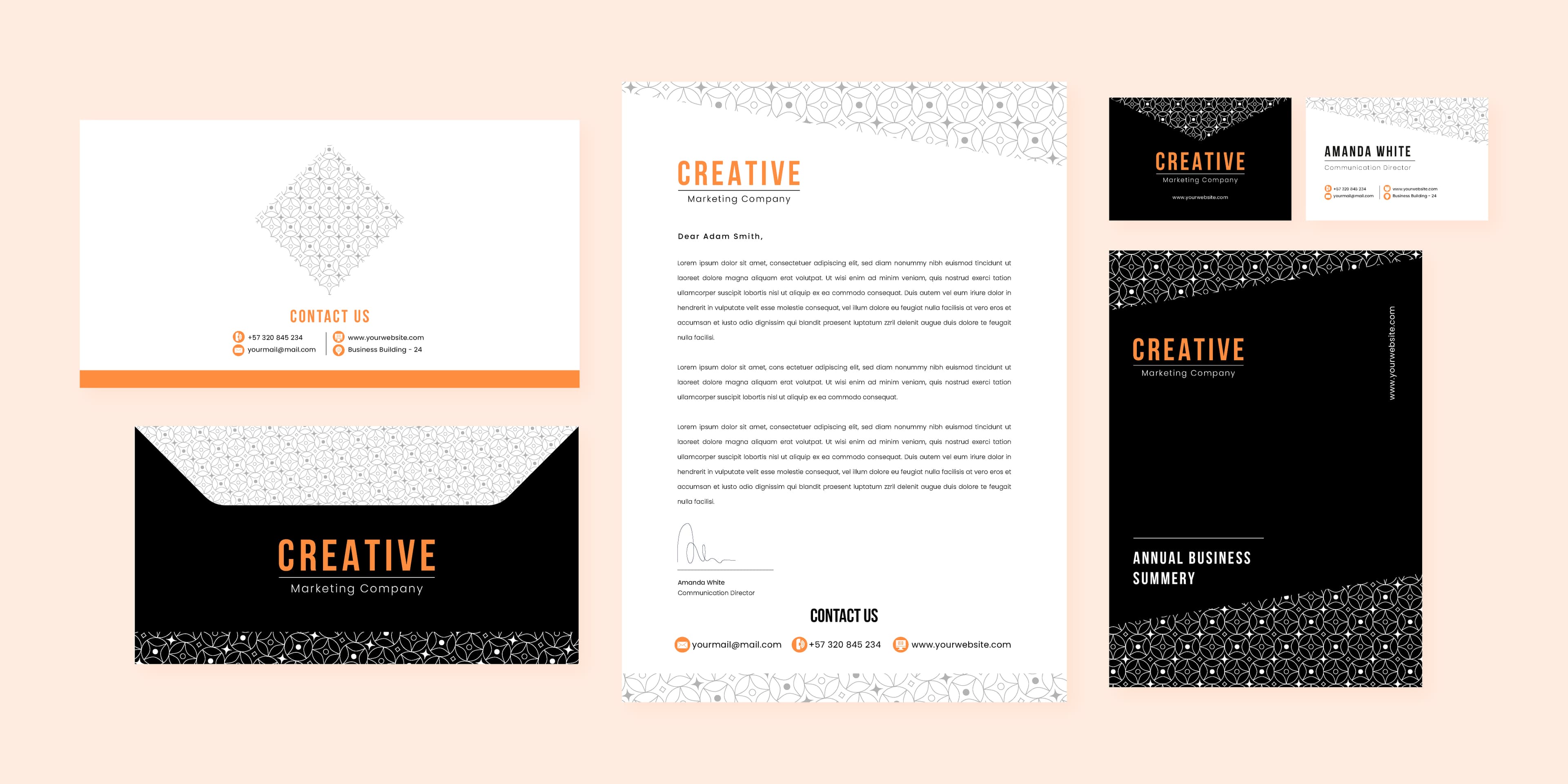
The Importance of Brand Consistency Across All Marketing Materials
Maintaining consistent branding across all your print and digital materials builds trust and recognition. Learn how to ensure brand coherence.
Read More

The stack of flyers in the recycling bin tells a familiar story: businesses spend money on print materials that look decent but don't generate results. The problem is rarely the printing, it's the design. Most print marketing fails because it's designed to look good rather than to convert. There's an important difference.
Converting print materials follow proven psychological frameworks, use design principles that guide the reader's behaviour, and include mechanisms that make response measurable. This guide covers the principles behind print materials that actually work.
AIDA, Attention, Interest, Desire, Action, has been the backbone of effective advertising since the 1890s. It works because it mirrors how humans process persuasive information. Every piece of print marketing should move the reader through these four stages.
Your reader is sorting post, walking past a shopfront, or flipping through a stack of business cards. You have 1-3 seconds to earn their attention.
Techniques that work:
Once you have attention, you need to keep it. Interest comes from relevance, the reader needs to see themselves in your message.
Techniques that work:
Interest says "this is relevant." Desire says "I want this." The difference is emotional engagement.
Techniques that work:
The most common reason print materials fail is a weak or absent call to action. The reader is interested, maybe even keen, but the path to response isn't clear.
Effective CTAs for print:
CTA design rules:
Every design element competes for attention. Visual hierarchy ensures the reader sees information in the right order:
The hierarchy test: Squint at your design from arm's length. Can you identify the three most important elements? If not, the hierarchy needs work.
Colour influences emotion and behaviour more than most designers realise:
| Colour | Emotional Response | Best For |
|---|---|---|
| Red | Urgency, excitement, appetite | Sales, food, clearance events |
| Blue | Trust, calm, reliability | Finance, healthcare, professional services |
| Green | Health, nature, growth | Organic products, wellness, environmental |
| Orange | Energy, enthusiasm, affordability | Retail promotions, youth brands |
| Yellow | Optimism, warmth, attention | Warnings, highlights, children's services |
| Purple | Luxury, creativity, wisdom | Premium brands, beauty, creative services |
| Black | Sophistication, authority, elegance | Luxury goods, fashion, professional firms |
Application tips:
Headline fonts: Bold, high-contrast, sans-serif fonts perform best for headlines. They're legible at a glance and convey confidence. Avoid script or decorative fonts for primary headlines, save them for accent text.
Body fonts: Choose a clean, readable typeface at minimum 10pt. Serif fonts (like Georgia) work well for longer body text. Sans-serif fonts (like Open Sans) work well for shorter blocks and bullet points.
Font pairing rules:
Cluttered designs overwhelm and confuse. Strategic white space:
For a deeper dive into flyer-specific strategies, read our flyer and leaflet design guide for local marketing.
Before your first meeting with a designer, gather:
Professional design costs vary based on complexity, number of revisions, and the scope of the project. Simple items like business cards sit at the lower end, while multi-page brochures and full stationery suites require a larger investment.
The key principle: design is an investment, not a cost. A well-designed flyer with a strong conversion rate generates far more revenue than a DIY design that gets discarded. Contact us for a quote tailored to your project.
You can test print materials just like digital ads:
| Method | Tracking Accuracy | Best For |
|---|---|---|
| Unique promo code | High | In-store redemption |
| QR code to landing page | High | Digital conversion tracking |
| Dedicated phone number | High | Service businesses |
| Custom URL | Medium | Website traffic measurement |
| "How did you hear about us?" | Low | General attribution |
Formula: (Revenue generated - Total cost) / Total cost x 100 = ROI%
To use this formula, add up your total campaign cost (design, printing, and distribution), then track how many enquiries and sales the campaign generates. Even a modest response rate can deliver a positive return, and the brand awareness from every flyer that doesn't convert immediately still has residual value over time.
Beautiful design doesn't always convert. The goal isn't to win a design competition, it's to generate a response. Sometimes a bold, simple layout with a strong offer outperforms an elegant, award-worthy design.
If your discount, free consultation, or special deal is hidden in small text at the bottom of the page, most readers will never see it. Lead with the offer.
Generic handshake photos and impossibly diverse boardroom scenes actually reduce credibility. Use real photos of your team, premises, and work, or invest in quality stock that feels authentic.
"We've been in business since 1997" is about you. "Your project, delivered on time, backed by 27 years of experience" is about the reader. Always frame copy from the customer's perspective.
"Contact us today" is forgettable. "Book before 31 March and save 20%" creates a reason to act now rather than later.
Every additional sentence, image, or design element competes for attention. If something doesn't directly support the conversion goal, remove it. The best print materials are ruthlessly focused.
Winelands Printing & Signage helps businesses create print marketing materials that don't just look professional, they generate measurable returns. From design concept to final print run, we focus on materials that convert.
Our design and print services:
Contact us to discuss your next print marketing project. We'll help you create materials that look outstanding and, more importantly, deliver the results your business needs.
Good design pays for itself, let's prove it with your next campaign.
Maintaining consistent branding across all your print and digital materials builds trust and recognition. Learn how to ensure brand coherence.
Read More
From letterheads to reception signage, build a cohesive brand presence across every touchpoint. A practical guide to corporate stationery and office branding.
Read More